The Smart Factory
A brand experience engineered for innovation.
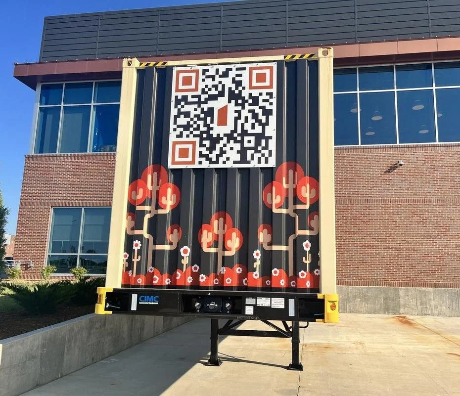
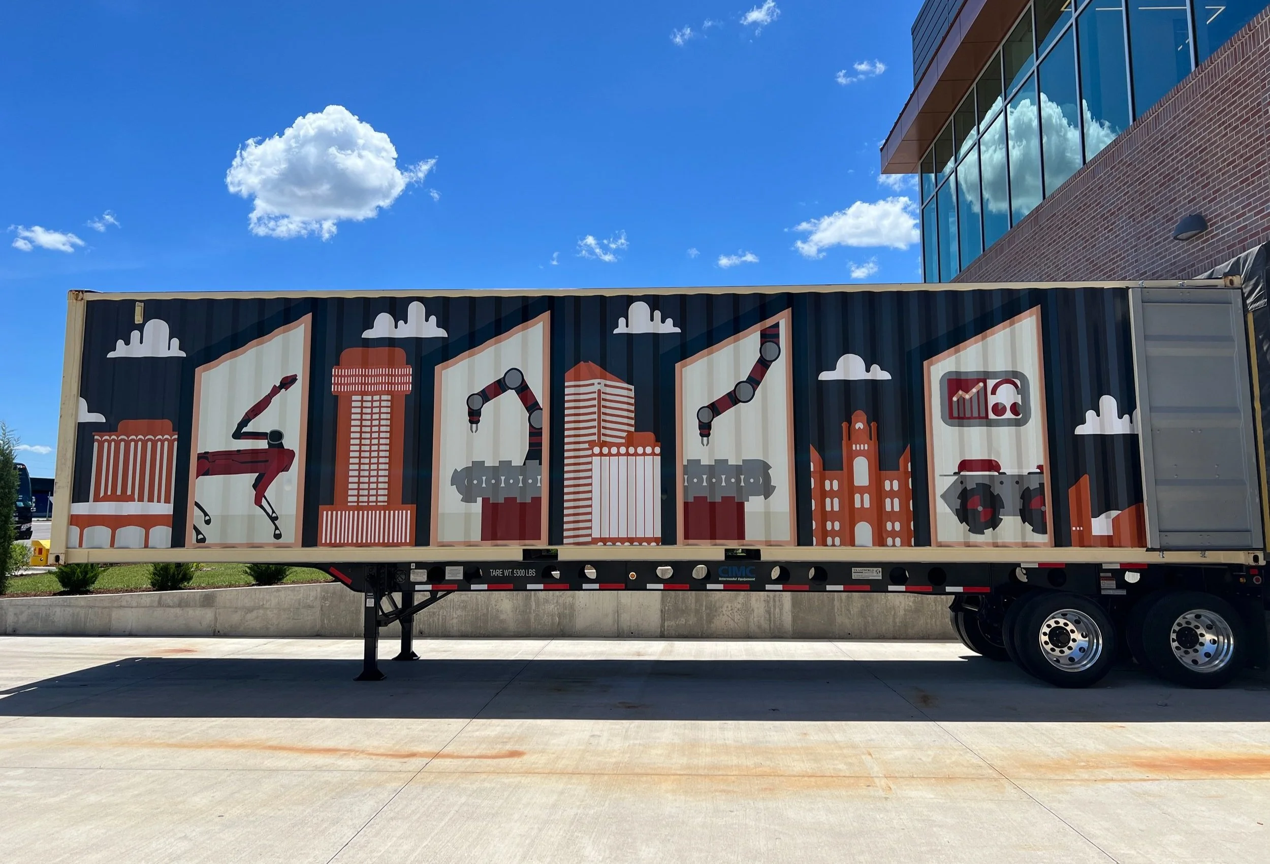
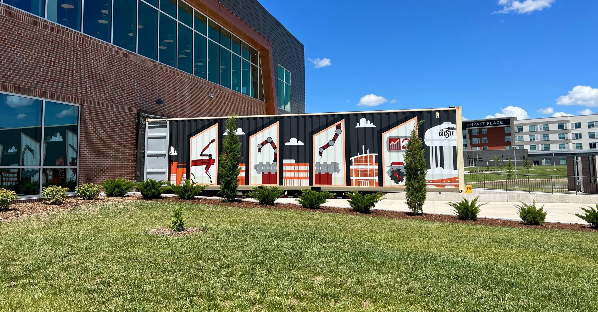
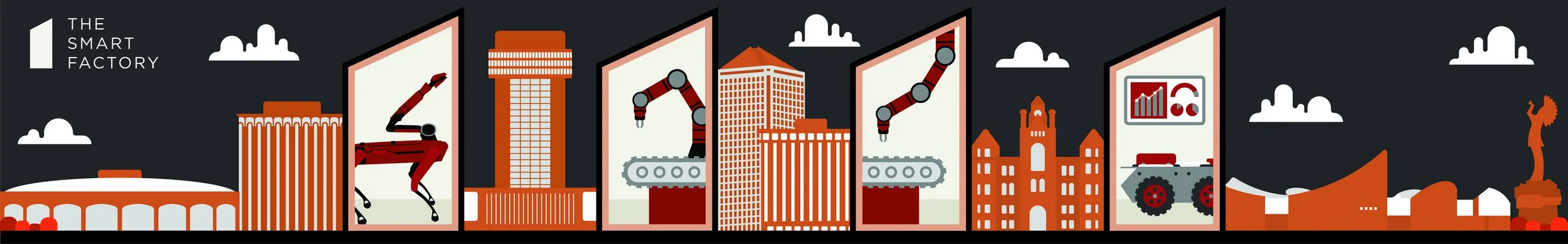
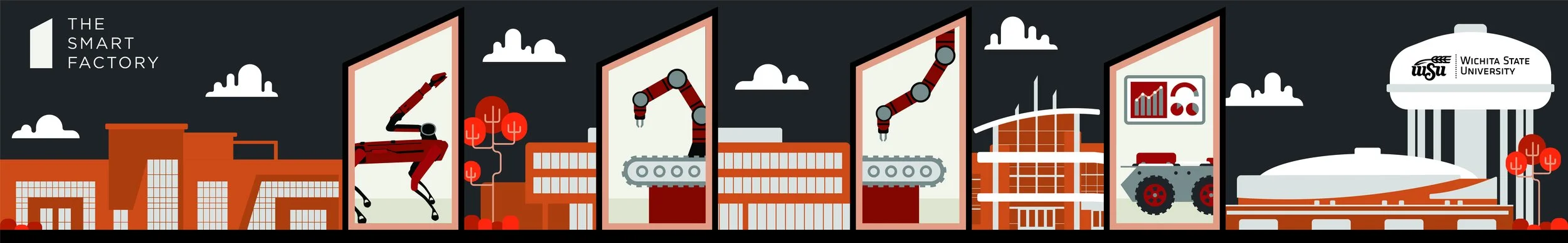
The Smart Factory’s (TSF) storage container design showcases innovation by opening the door to a sustainable ICT community. The vision for the container incorporates “windows”—in the shape of the brick symbol presented in the visual identity—that “look into” the container showing the innovative experience going on inside. Meanwhile, on the outside of these “windows,” the ICT/WSU community is represented in a futuristic style to show TSF’s impact on it. In this futuristic community, visuals of plant life will be present to represent TSF’s commitment to sustainability.
TSF’s color palette is used to highlight the four guiding principles: burnt camel for a futuristic spin on ICT and WSU (community), electric red for plant life (sustainability), deep red for the promotion of STEM education going on inside the “windows” (philanthropy), and dark grey for the fun, innovative work going on inside as well (experience). The rest of the color palette will be used as accent colors in the design.
Overall, the storage container design provides an immersive experience to showcase how the innovation going on inside impacts what’s on the outside: our community.

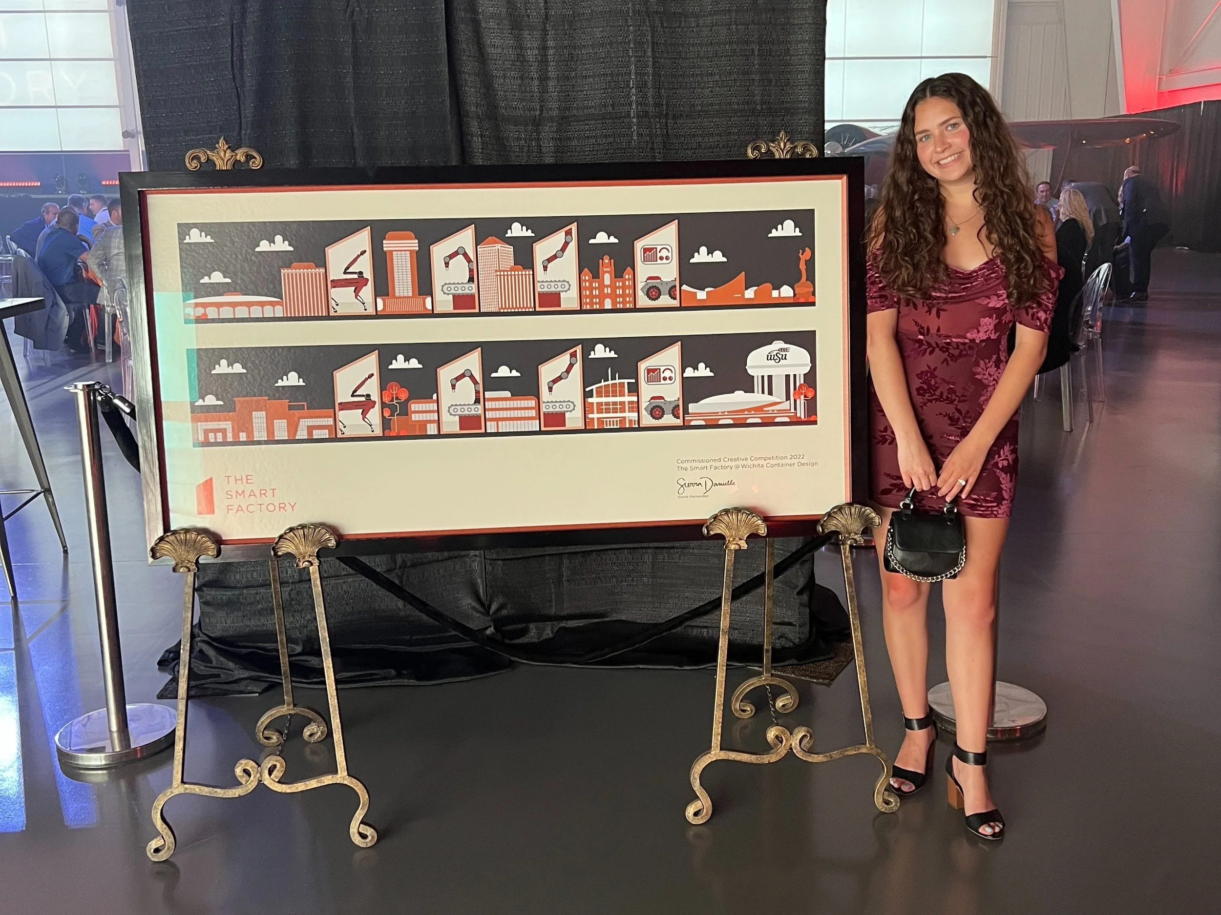
“WSU Student highlights Smart Factory pillars and her design prowess for storage container wrap.”